Search redesign to better define user query, leading to 14% increase in CTR and supporting discovery intent
role
Lead Product Designer
remix.supply
remix.supply
team
Researchers, PMs, Developers, TPMs, and Analysts.
platform
iOS & Android App
impact
14% increase in CTR to placing trades
remix.supply
remix.supply
OVERVIEW NARRATION

INTRODUCTION
Legacy search was purely navigational, but only worked for 4.2% of users. As Angel One expanded into new products like insurance, ETFs, loans, search needed to evolve to support discovery too.
PROBLEM
Discovery - intent users type vague queries (lacking confidence & effort) while our tech has limitations.
This was leading to long uncurated list of irrelevant results, leading to users drop-off.
So, UX needed to find a way to shape better queries for improved results.
WHO IS THIS USER?
Click to expand and read this section
SOLUTION
Tap, don't type.
Suggestion prompts
helping defining query better / with more context —> improving results —> CTR
enhanced filter UX
Clearer visibility to new investment services with nested filters under each category for better funnel UX
for improved scan-ability & bringing up new investment tool options
handled discovery edgecases
for improved scan-ability & bringing up new investment tool options
IMPACT
14%
increase in overall search CTR
6 —>7
Shift in customer NPS
48%
Top-3 result CTR preserved


KEY DETAILS ABOUT THE PROCESS, DECISIONS & DESIGN
DATA TO PROBLEM UNDERSTANDING
Our internal AI Data Analyst Agent helped us figure the problem behind the data when user research was not possible
Due to time and resource constraints, we skipped a formal research study. Instead, we brainstormed with an internal AI data analyst agent — drawing on past research, VOC, and support data — and ran a workshop to identify hypotheses we had the most conviction on, designed & shipped for it, later, monitored performance.

KEY DECISIONS
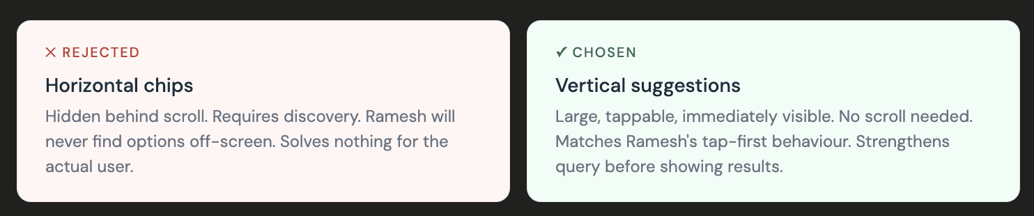
What we decided NOT to add from PRD…
Horizontal Suggestion Chips
The PM's instinct was horizontal chips — tidy, low-footprint, non-disruptive. But for Ramesh, horizontal scrolling is invisible. He won't swipe to find suggestions sitting off-screen. Chips that require discovery are chips that don't exist.

Promotional Cross Selling Banners in Search
PMs proposed adding promotional banners and personalised content — like credit scores and loan offers — to the search landing and results pages. We pushed back, guarding search as a strictly functional, hygiene feature. Introducing promotional material risked creating blind spots and undermining the integrity of search results overall.


SOLUTION PROCESS
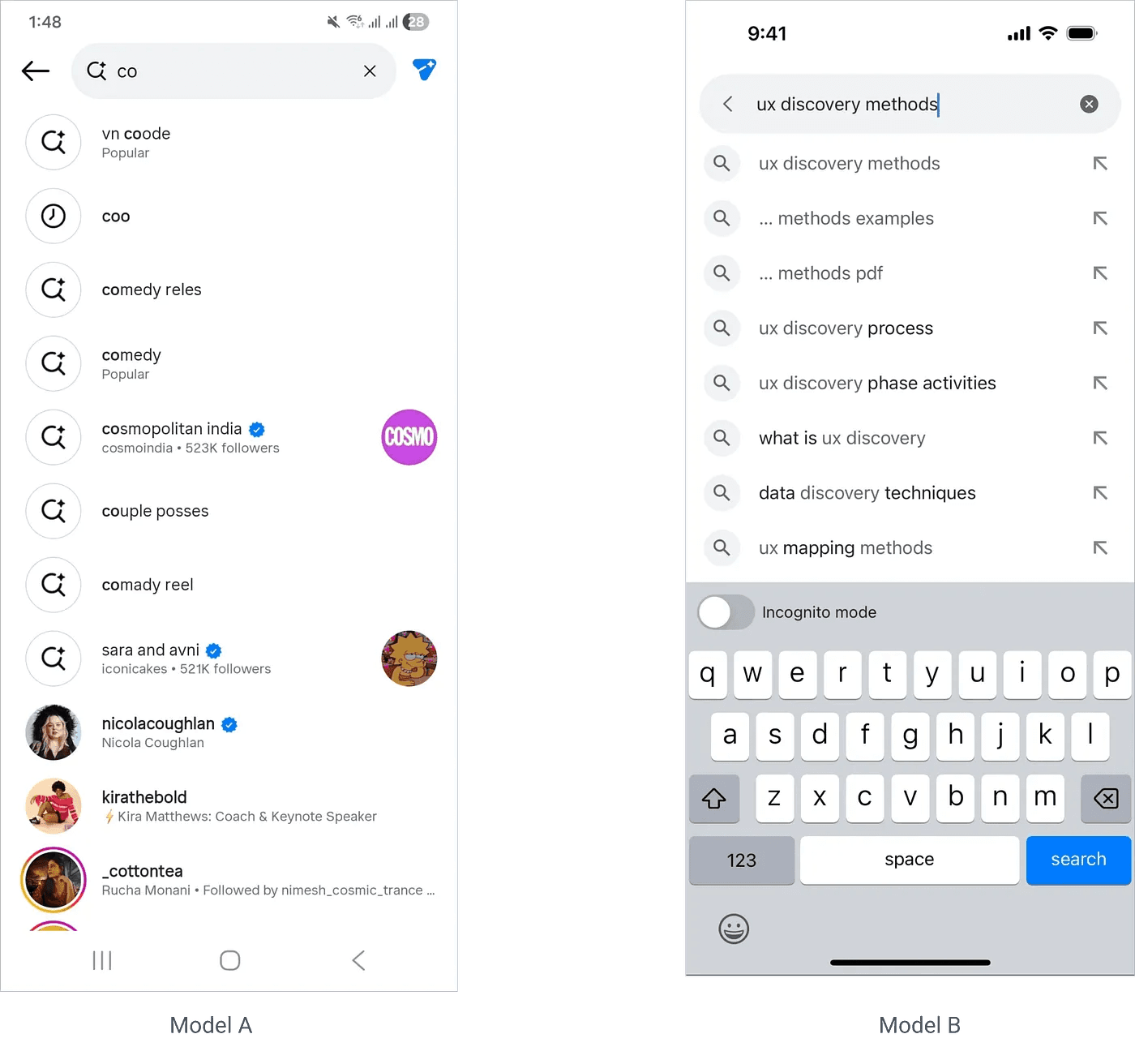
Two Philosophies of Search
When I looked at how other products handled suggestions, two models emerged.
Model A — Accept & show (Instagram style): User types, results appear instantly below. Suggestions are almost a shortcut to a result, not a query-building tool.
Model B — Strengthen the query (Google style): Suggestions help the user complete or refine what they’re trying to say before results appear. The query gets better first
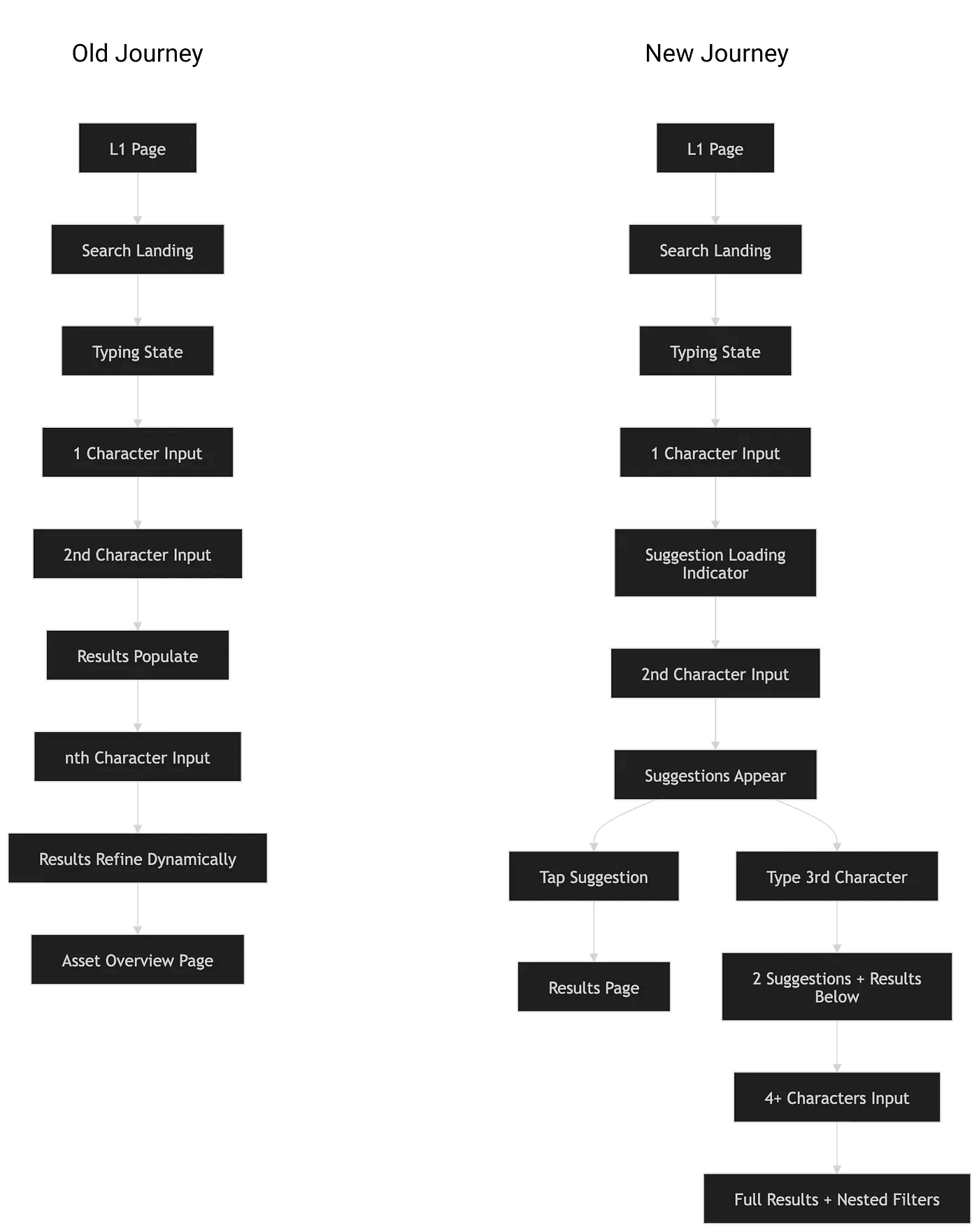
Here’s what the new search journey looked like:
The suggestions appear vertically, not horizontally. They’re large, tappable, and immediately visible. No scrolling required. Ramesh sees them, recognises them, taps one — and lands exactly where he wanted to be.
The nested filters only appear once the query has enough context (4+ characters). By that point, the user has already expressed intent. Filters now have something to work with.
END NOTES
A few things I took from this:
The user's constraint is the design brief. Once I knew Ramesh was tap-first and type-reluctant, every decision had a filter.
Data tells you what. Research tells you why. You need both.
The PM names the feature. You solve for the experience. Own your half.
The best design decision I made wasn't a UI choice. It was asking "why".
THANK YOU FOR YOUR PATIENCE :)