Tracing a core decision-making screen back to its original purpose instead of blindly shipping PM requests : redesigning for scalability, improved user NPS
role
Lead Product Designer
remix.supply
remix.supply
team
Researchers, PMs, Developers, TPMs, and Analysts.
platform
iOS & Android App
impact
13% increase in pre-trade journey CTR
remix.supply
remix.supply
INTRODUCTION
Monday. Wednesday. Friday. Three PMs. One key screen.
The bottom sheet overview sits between a trader and their next decision. Small screen. High stakes. Millions of daily glances. And over time, quietly — invisibly — it had stopped making sense.
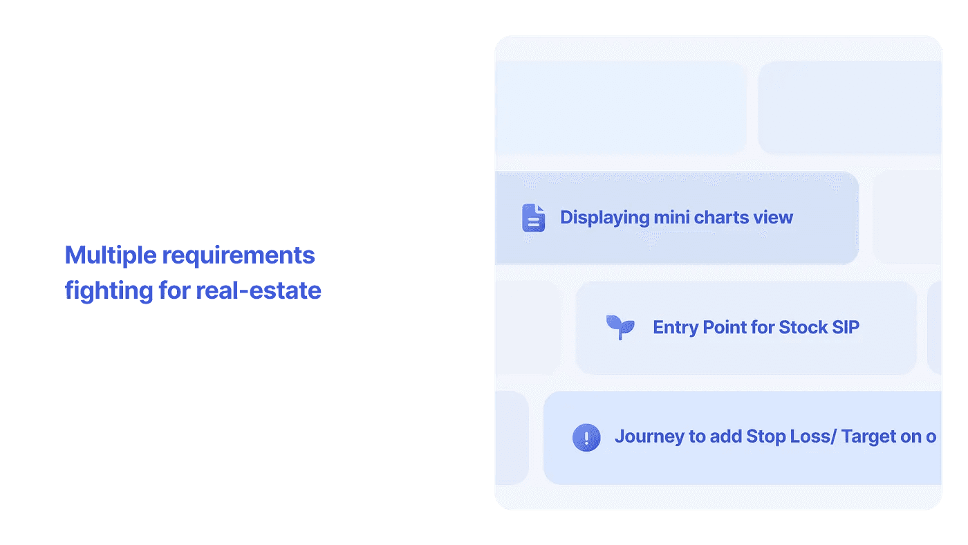
On Monday, a PM asked for a chart snippet to save users some clicks. On Wednesday, a different PM wanted a Stock SIP button for visibility. By Friday, a third PM had filed a Jira for a stop loss button. None of them had spoken to each other. Nobody owned the component. Nobody was asking what it was actually for.

"Can we add a line of context somewhere around it? And maybe introduce some scroll?"
— PM response when asked about available space
I got everyone in a room. The meeting ended — as these meetings often do — with the job landing back on the designer to figure out how to fit everything together. Then a fourth Jira arrived.
PROBLEM
Screen had lost it's original purpose. Resulting in button/CTA dump, pilling design debt & ever- increasing height of a "bottom sheet".


None of the PMs were wrong. Each request made sense in isolation. A chart snippet aids decision-making. SIP visibility drives revenue. Stop loss is genuinely useful for holders. The problem wasn't the requests — it was that nobody was looking at the overview as a whole.
I went looking for documentation. Prior thinking on why the short overview existed. Its purpose, guardrails, success metrics. There was none.
A component doesn't break from bad design — it breaks when no one asks what it was originally built for.
With help from a senior stakeholder who'd been at the company long enough to remember, the original intent surfaced. AngelOne was the first in market to build it. The purpose was elegant: let users watch one stock's price movement while still seeing others in the background. A multitasking tool. A focused lens. Over time, things got added, then more things, until the overview had become a dumping ground for anything needing visibility.
SOLUTION
Define it before designing it. With a sustainable solution


✅ Split content into three layers: live data (fixed, always visible), actions (horizontal scroll, infinitely scalable), contextual meta (appears only when needed)
✅ One rule to govern all future requests: if it's not for immediate decision making, it belongs in the long overview
✅ Horizontal scroll for actions basis cohortisation & priortisation — graph gets the justified emphasis for user's decision making
✅ Tooltips auto-retire after 15 interactions — helpful when new, gone when not needed
✅ Framework documented so the next PM request has an answer before design opens Figma
IMPACT
-4 secs
reduced time for user to execute trade
34%
increase in user's engaging with new feature's CTAs
15
edge case states designed and documented
BELOW SECTIONS PROVIDE MORE DETAILS TO THE PROCESS, DECISIONS & DESIGN
THE WHOLE STORY
How the design actually happened
1️⃣ Three PMs. No shared owner. One meeting that resolved nothing.
Got everyone in a room. The meeting confirmed the structural problem — nobody owned the component. The job landed back on design. A fourth Jira arrived the same day.
2️⃣ Went looking for documentation. Found none.
No prior thinking on purpose, guardrails, or success metrics. The absence of documentation was itself a diagnosis — the component had been drifting without a rudder.
3️⃣ Traced the original purpose with a senior stakeholder
AngelOne built it first. The original intent — a multitasking lens for watching one stock while seeing others — had been completely buried. That intent became the foundation for the redesign.
5️⃣ Wrote a diagnosis document, not a design proposal
Brought leadership a structured case for why adding more elements wouldn't fix the problem — and got sign-off for a full rethink before opening Figma.
6️⃣ ~30 explorations. One honest answer.
Tried almost everything. Horizontal scroll for actions was the only approach that maintained density without compromising clarity on a mobile screen.
7️⃣ Aligned stakeholders at skeleton fidelity, not hi-fi
Coloured blocks kept conversations on priorities and hierarchy — not colours and spacing. Alignment happened faster because the medium didn't invite the wrong opinions.
8️⃣ 15 edge case states. All designed, all prototyped.
Sat with QA and PMs to map every conditional state from past experience. Designed dedicated prototypes for interactions, transitions, and animations — including onboarding tooltips that disappear after 15 completions.
9️⃣ Wrote the documentation I wish had existed
Purpose defined. Framework documented. Guardrails established. The next designer — and the next PM — now has a clear answer to "does this belong here?"

END NOTE
What I’d Take From This
Requirements aren’t the problem statement. Each PM had a legitimate need. My job wasn’t to resist those needs — it was to find the structural answer that could hold all of them without making things worse.
Lack of documentation is a design problem. When nobody can tell you why a component exists, the component has already started to fail. Writing the documentation I wish had existed isn’t extra work. It’s part of the job.
Stakeholder alignment at low fidelity is faster than at high fidelity. Coloured blocks don’t trigger aesthetic opinions. They focus people on what matters: hierarchy, priority, purpose.
Scalability is a form of craft. It doesn’t photograph as well as a beautiful UI. But it’s the difference between a product that degrades gracefully over time and one that needs rescuing every eighteen months.
The next designer will never know this battle happened.
That’s exactly how it should be.
THANK YOU FOR YOUR PATIENCE :)